I had the wonderful opportunity to create the branding and packaging for Down the Road Spice Co., a small business that sells organic, small batch spices that will elevate your cooking experience. I look forward to watching this brand flourish!
Pictured are my initial brandmark and themeboard exploratories as well as final masala packaging.
The Holiday Season can be filled with tacky Christmas sweaters, massive amounts of glitter, and a whole lot of fun. For these Pringles cans I wanted to combine the warmth and class of familiar Christmas decor with the playfulness of the Pringles brand. By playing off the traditional clear tubes of ornaments, we created a customized can of Pringles "ornaments" filled with delicious crisps.
Original concept idea, sketch and typography are mine.
Illustration: Ed Denson
Next Photos: LOUD (Design Direction and Design with Team), Red White and Blue Cans (Concept and Design), New Flavors (Concept Development), Back-to-School Lunch Packs (Concept and Illustration)
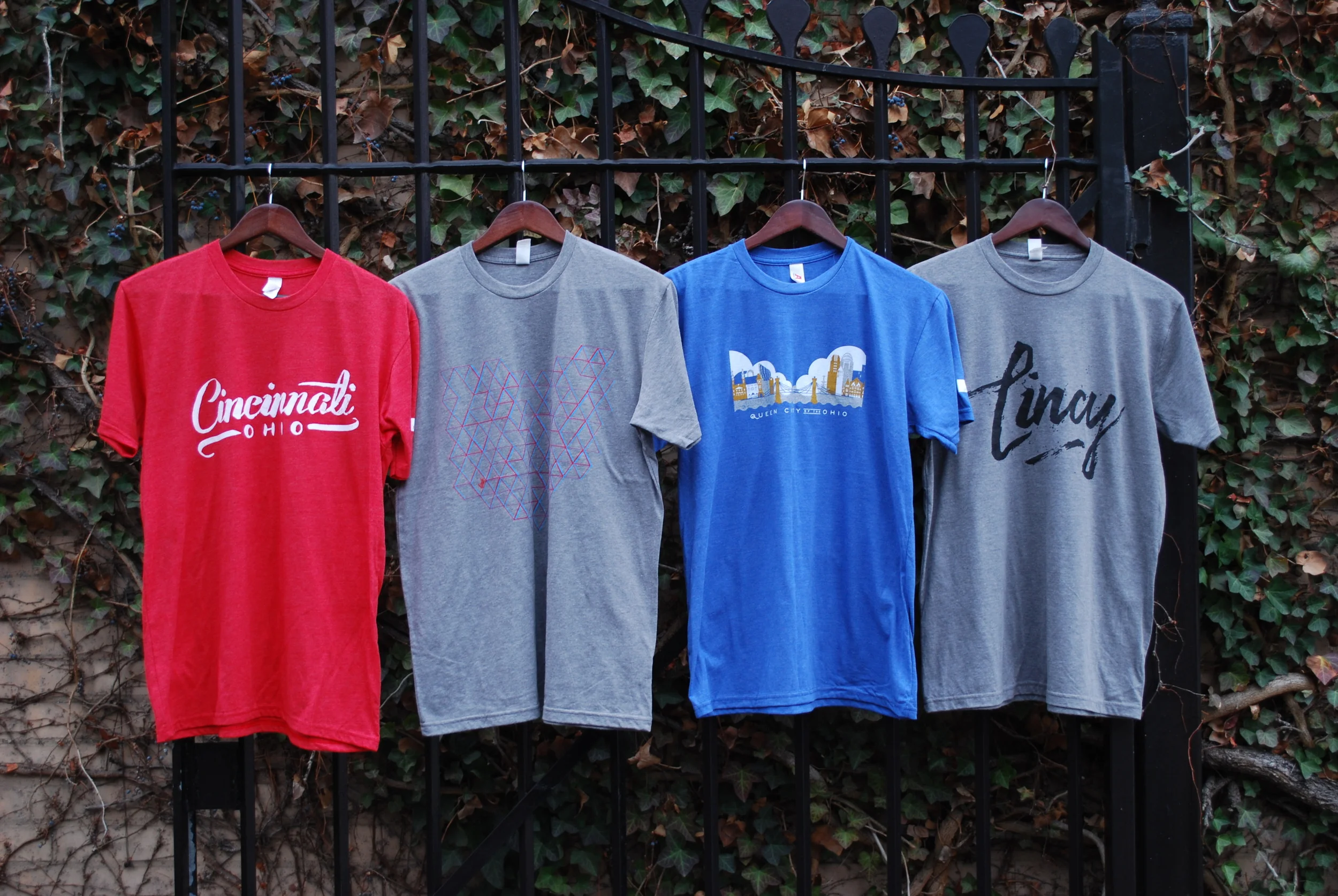
I created a t-shirt campaign to raise money for four deserving charities. My goal was to create a program that would combine my passion for design and my passion for helping others.
I created and ran a t-shirt design competition, where everyone at my company was encouraged and welcome to submit a shirt design. After designs were submitted, I ran a company-wide vote to determine the top four shirts that would be printed and sold to raise money for the charities.
100% of the profits from the sales went to support four deserving organizations. One charity supported children and families, while another focused on humanitarian and global aid, another supported arts and education, and another supported the environment. My hope in choosing a wide range of charities was to create a platform for everyone to be able to pick an organization that they were excited about and ready to support. We were able to raise almost a thousand dollars for these charities in just one week of sales.
T-shirt Designs (L to R): Patrick Dewenter, Paul Stutzman, James Billiter, & Christa Seta.
I created this logo for a Bakery in Raleigh, North Carolina. The magnolia flower is symbolic of their southern roots, and the sophisticated, classic type is reminiscent of traditional bakeries.
Since originally branding SSB, I have had the privilege of expanding their brand across multiple touchpoints including shipping boxes, corrugate boxes, dry cookie mix bags, and much more. Check out their website for shipping anywhere in the US!
Dry cookie mix packaging and layout photography by @allison.mc (www.allisonmcadams.com).
I had the wonderful opportunity to create a concept for the Truly Free redesign for my friends at @hireheadword! This concept allowed me to explore how to incorporate Truly Free’s passion for their existing “quilt” pattern into a more vibrant color scheme, modern design style and more cohesive product lineup.
Created for Headword.co.
I created these Brandmarks for a Senior Home Care Company based out of Philadelphia, Pennsylvania. The new marks were designed to bring some freshness and life to an otherwise serious brand.
I created this Bridal Shower Invite for a Bride that was getting married during Cincinnati's Bock Fest. The mascot of the Festival is a goat, so I wanted to do a fun twist on this beloved local mascot and use that as the theme for the shower. The shower theme was all things pairs, pairs of goats, pairs of food, pairs of drinks, and much more.
I created these Baby Shower invites for a friend of mine. I wanted the invites to be sweet, and delicate, yet classy enough to be framed for a special memory after the shower took place. The coral, teal and gray colors were chosen to nod to the baby girl without having to go full-fledged girly with traditional baby colors.
I created this Save the Date for a southern bride that was looking for colorful florals. I hand painted this invite with gouache and paired it with minimal typography.
I created this Shower invite by hand painting the flowers to mimic the brides wedding bouquet.
I love creating patterns and exploring scaling and colors. These patterns were created for a variety of clients and projects.
Cocktail glasses were designed to benefit International Justice Mission.
Beer glasses were designed in partnership with Brink Brewing Co. for an artist series event.
Brink glasses were photographed by Brink Brewing Company.
My Grandparent's house is filled with inspiration. There are intricate patterns everywhere just waiting to be revitalized. From the wallpaper in the dining room to the detailing in the tile work, there are prints and patterns found all over their house just asking to be brought back to life. I created this series for instagram to be quick studies (usually about one hour) to purely have fun with color and shape.
These swatches depict those found patterns (left) and my new interpretation of them (right).
I was asked to modernize a logo for a PAC in Washington, D.C. These icons are a range of options that all depicted a simplified version of the Statue of Liberty.
Quick Illustrations painted with Gouache.
Iron Man T-Shirt Design.
Character Illustrations for Church Bible Curriculum.
The challenge of this project was to create a premium line of cat food for the Iams brand. By using beautiful food imagery positioned on plates suitable for humans, we were able to serve up a cat food dish that was both tasty for cats, and appetizing enough for a cat owner to pick up off the shelf.
I created these logos for an independant contractor. I wanted each logo to be modern, and clean, and depict the wide range of projects that he is involved in.
One of the design projects I most enjoy doing is creating unique wedding packages for special couples. I love being able to figure out what is unique about each couple and finding a way to work that uniqueness into my design solution. Each package is one-of-a-kind, and specific to that couple.
For this design suite, I designed a letterpressed invite and rsvp card with coral edge painting, and a custom envelope liner with the bride and groom's initials.
I designed these custom illustrations for CCL Label Worldwide to showcase their varying printing techniques. I chose a city theme to capture the beautiful print techniques in the small details of each illustration. Each bottle showcases one iconic city and building. The lineup is held together by the common illustration style.